
# transform-origin
transform-origin
- 作用:定义【translate】变换的原点
- 使用:transform-origin:x y z;
| 值 | 原点 |
|---|---|
| center | 盒子中心 |
| top | 盒子上边中心 |
| left | 盒子左边中心 |
| bottom right | 下右顶点 |
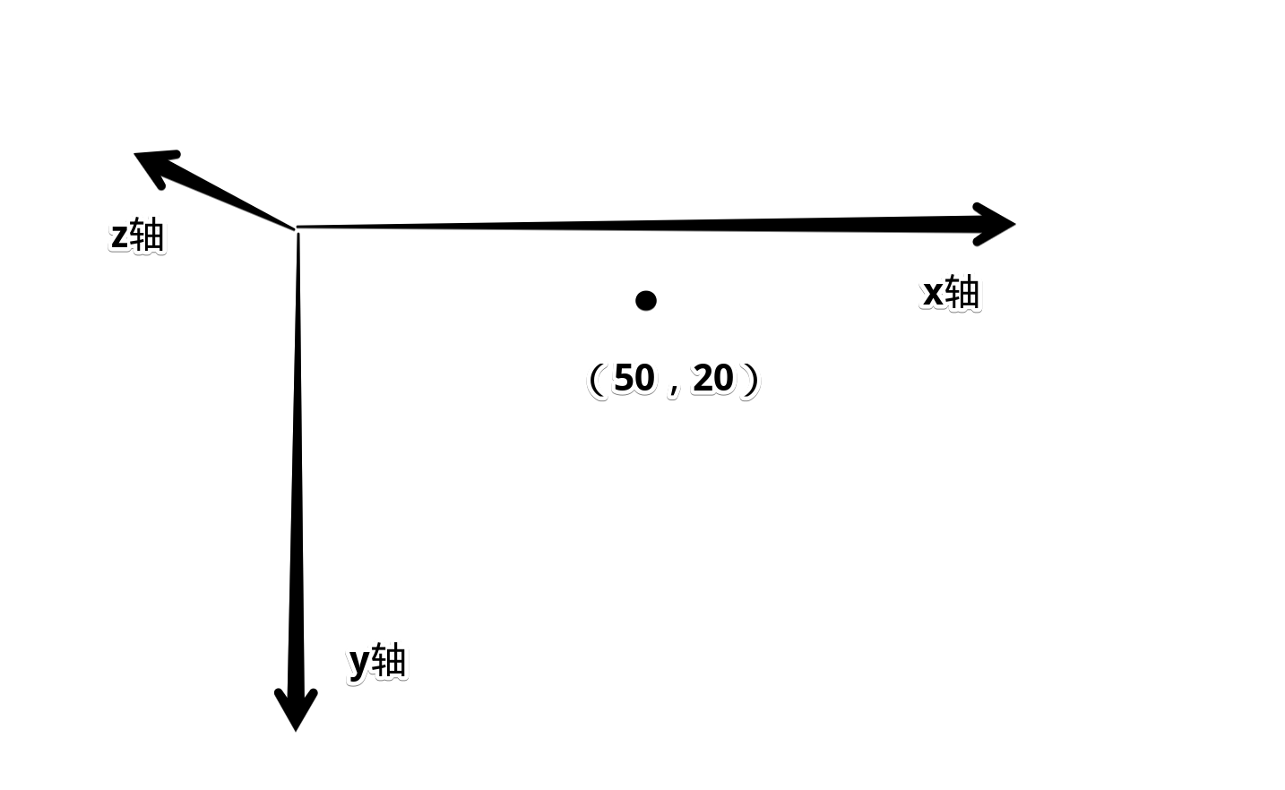
| 50px 20px | x轴向左跑50,y轴向下跑20 |
图解
# transform-function
# rotate
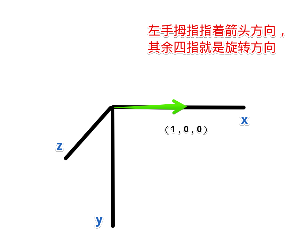
- 作用:2D旋转。旋转圆心根据transform-origin定义
- 定义:rotate(angle)
- 入参:旋转角度。
- 角度:有四种单位,可接受负数,逆时针旋转
| 入参 | 值 |
|---|---|
| 45deg | 45° |
| 400grad | 360° |
| 6.2832rad | 360°【2π】 |
| 1turn | 360° |
旋转球
<body>
    <div id="container">
        <div id="ball">你好</div>
    </div>

    <style>
        #container {
            position: relative;
            width: 200px;
            height: 200px;
            background-color: rgb(118, 144, 233);
            padding-left: 50px;
            padding-top: 50px;
            box-sizing: border-box;
            overflow: hidden;
        }

        #ball {
            width: 100px;
            height: 100px;
            background-color: #fff;

            transform-origin: center;
            transition: all 1s ease;
        }
        #ball:hover {
            transform: rotate(360deg);
        }
    </style>
</body>
1
2
3
4
5
6
7
8
9
10
11
12
13
14
15
16
17
18
19
20
21
22
23
24
25
26
27
28
29
30
2
3
4
5
6
7
8
9
10
11
12
13
14
15
16
17
18
19
20
21
22
23
24
25
26
27
28
29
30
# rotate3d
- 作用:定义3d旋转动画
- 旋转轴:transform-origin定义轴的起点,rotate3d三个值【x, y, z】定义矢量方向,合成旋转轴
- 使用:rotate3d(a, y, z, a)
| 入参 | 含义 |
|---|---|
| x | 【0~1】旋转轴X坐标方向的矢量 |
| y | 【0~1】y坐标方向的矢量 |
| z | 【0~1】z坐标方向的矢量 |
| a | 旋转角度,与rotate一样,四种单位。支持负值逆时针旋转 |
简写
- 单独一个方向旋转可以简写
| 属性 | 相当于 |
|---|---|
| rotateX(a) | rotate3d(1, 0, 0, a) |
| rotateY(a) | rotate3d(0, 1, 0, a) |
| rotateZ(a) | rotate3d(0, 0, 1, a) |
- 旋转坐标轴
- 原点为【transform-origin】定义,默认是【center】
翻转案例
<body>
    <div id="container">
        <div id="ball">你好</div>
    </div>

    <style>
        #container {
            position: relative;
            width: 200px;
            height: 200px;
            background-color: rgb(118, 144, 233);
            padding-left: 50px;
            padding-top: 50px;
            box-sizing: border-box;
            overflow: hidden;
        }

        #ball {
            width: 100px;
            height: 100px;
            background-color: #fff;

            transform-origin: center;
            transition: all 1s ease;
        }
        #ball:hover {
            transform: rotate3d(1, 0, 0, 180deg);
        }
    </style>
</body>
1
2
3
4
5
6
7
8
9
10
11
12
13
14
15
16
17
18
19
20
21
22
23
24
25
26
27
28
29
30
2
3
4
5
6
7
8
9
10
11
12
13
14
15
16
17
18
19
20
21
22
23
24
25
26
27
28
29
30
# scale
- 作用:2d平面图像伸缩,伸缩的起点由transform-origin定义
- 使用:
- scale(both)
- scale(x, y)
- 入参:
- x和y方向整体共同伸缩比例
- x轴方向伸缩的比例,y轴方向伸缩的比例
伸缩内容
- 整个盒子内容都会被伸缩,包括文字
both
<body>
    <div id="container">
        <div id="ball">你好</div>
    </div>

    <style>
        #container {
            position: relative;

            width: 200px;
            height: 200px;
            background-color: rgb(118, 144, 233);
            padding-left: 50px;
            padding-top: 50px;
            box-sizing: border-box;
            overflow: hidden;
        }
        #ball {
            width: 100px;
            height: 100px;
            background-color: #fff;

            transform-origin: center;
            transition: all 1s ease;
        }
        #ball:hover {
            transform: scale(1.5);
            background-color: rgb(252, 92, 92);
        }
    </style>
</body>
1
2
3
4
5
6
7
8
9
10
11
12
13
14
15
16
17
18
19
20
21
22
23
24
25
26
27
28
29
30
31
2
3
4
5
6
7
8
9
10
11
12
13
14
15
16
17
18
19
20
21
22
23
24
25
26
27
28
29
30
31
分别伸缩
- x轴放大1.5倍,y轴不变
<body>
    <div id="container">
        <div id="ball">你好</div>
    </div>

    <style>
        #container {
            position: relative;

            width: 200px;
            height: 200px;
            background-color: rgb(118, 144, 233);
            padding-left: 50px;
            padding-top: 50px;
            box-sizing: border-box;
            overflow: hidden;
        }
        #ball {
            width: 100px;
            height: 100px;
            background-color: #fff;

            transform-origin: left;
            transition: all 1s ease;
        }
        #ball:hover {
            transform: scale(1.5, 1);
            background-color: rgb(252, 92, 92);
        }
    </style>
</body>
1
2
3
4
5
6
7
8
9
10
11
12
13
14
15
16
17
18
19
20
21
22
23
24
25
26
27
28
29
30
31
2
3
4
5
6
7
8
9
10
11
12
13
14
15
16
17
18
19
20
21
22
23
24
25
26
27
28
29
30
31
# scale3d
- 作用:3d图像各方向伸缩比例
- 使用:scale3d(x, y, z)
- 简写:
| 简写 | 相当于 |
|---|---|
| scaleX(a) | scale3d(a, 1, 1) |
| scaleY(a) | scale3d(1, a, 1) |
| scaleZ(a) | scale3d(1, 1, a) |
# skew
- 作用:二维平面上的倾斜,对应的像素会做拉伸处理
- 使用:skew(x, y)
- 入参:倾斜角度,同rotate四种单位
- 简写:
| 简写 | 相当于 |
|---|---|
| skewX(x) | skew(x, 0) |
| skewY(x) | skew(0, y) |
沿x轴倾斜45度 = y轴向x轴
逆时针倒45度
<body>
    <div id="container">
        <div id="ball">你好</div>
    </div>

    <style>
        #container {
            position: relative;

            width: 200px;
            height: 200px;
            background-color: rgb(118, 144, 233);
            padding-left: 50px;
            padding-top: 50px;
            box-sizing: border-box;
            overflow: hidden;
        }
        #ball {
            width: 100px;
            height: 100px;
            background-color: #fff;

            transform-origin: center;
            transition: all 500ms ease;
        }
        #ball:hover {
            transform: skew(45deg, 0);;
        }
    </style>
</body>
1
2
3
4
5
6
7
8
9
10
11
12
13
14
15
16
17
18
19
20
21
22
23
24
25
26
27
28
29
30
2
3
4
5
6
7
8
9
10
11
12
13
14
15
16
17
18
19
20
21
22
23
24
25
26
27
28
29
30
沿y轴倾斜45度 = x轴向y轴
逆时针倒45度
<body>
    <div id="container">
        <div id="ball">你好</div>
    </div>

    <style>
        #container {
            position: relative;

            width: 200px;
            height: 200px;
            background-color: rgb(118, 144, 233);
            padding-left: 50px;
            padding-top: 50px;
            box-sizing: border-box;
            overflow: hidden;
        }
        #ball {
            width: 100px;
            height: 100px;
            background-color: #fff;

            transform-origin: center;
            transition: all 500ms ease;
        }
        #ball:hover {
            transform: skew(0, 45deg);
        }
    </style>
</body>
1
2
3
4
5
6
7
8
9
10
11
12
13
14
15
16
17
18
19
20
21
22
23
24
25
26
27
28
29
30
2
3
4
5
6
7
8
9
10
11
12
13
14
15
16
17
18
19
20
21
22
23
24
25
26
27
28
29
30
# translate
- 作用:平移
- 使用:translate(x, y)
- 入参:向量上的平移量,如果是百分比,参照的是自身向量方向上的长度
平移:自身x轴长100px,所以x轴平移50px,y轴同
<body>
    <div id="container">
        <div id="ball">你好</div>
    </div>

    <style>
        #container {
            position: relative;
            margin: 50px;
            width: 200px;
            height: 200px;
            background-color: rgb(118, 144, 233);
            overflow: hidden;
        }
        #ball {
            width: 100px;
            height: 100px;
            background-color: rgb(185, 247, 183);

            transform-origin: center;
            transition: all 500ms ease;
        }
        #ball:hover {
            transform: translate(50%, 50%);
        }
    </style>
</body>
1
2
3
4
5
6
7
8
9
10
11
12
13
14
15
16
17
18
19
20
21
22
23
24
25
26
27
2
3
4
5
6
7
8
9
10
11
12
13
14
15
16
17
18
19
20
21
22
23
24
25
26
27
# translate3d
- 作用:3d方向上的平移矢量
- 使用:translate3d(x, y, z)
- 简写:
| 简写 | 相当于 |
|---|---|
| translateX(a) | translate3d(a, 0, 0) |
| translateY(a) | translate3d(0, a, 0) |
| translateZ(a) | translate3d(0, 0, a) |