
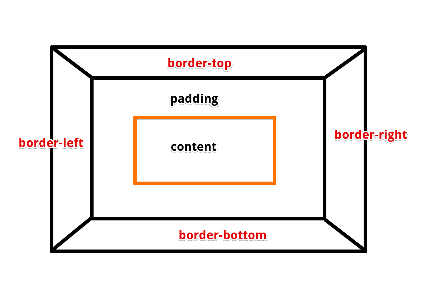
# BFC盒子
BFC
- 块格式化上下文(Block Formatting Context,BFC)
- 块格式内的元素不会影响到外部样式,作为一个绝对样式隔离的空间
条件
| 条件 | 设置 |
|---|---|
| 根元素 | body |
| 浮动元素 | 元素的 float 不是 none |
| overflow | 计算值(Computed)不为 visible 的块元素 |
| 绝对定位元素 | 元素的 position 为 absolute 或 fixed |
| 行内块元素 | 元素的 display 为 inline-block |
| 表格单元格 | 元素的 display 为 table-cell,HTML表格单元格默认为该值 |
| 表格标题 | 元素的 display 为 table-caption,HTML表格标题默认为该值 |
| 匿名表格单元格元素 | 元素的 display 为 table、table-row、 table-row-group、table-header-group、table-footer-group分别是HTML table、row、tbody、thead、tfoot 的默认属性或 inline-table |
| display | 值为 flow-root 的元素 |
| contain | 值为 layout、content 或 paint 的元素 |
| 弹性元素 | display 为 flex 或 inline-flex 元素的直接子元素 |
| 网格元素 | display 为 grid 或 inline-grid 元素的直接子元素 |
| 多列容器 | 元素的 column-count 或 column-width (en-US) 不为 auto,包括 column-count 为 1 |
column-span 为 all 的元素始终会创建一个新的BFC,即使该元素没有包裹在一个多列容器中(标准变更,Chrome bug)。
margin重叠: 非BFC盒子之间,内部的子盒子margin溢出且与外面别的margin重叠,说明本盒子内部布局影响到外部
<body>
    <div class="nobfc">
        <div>盒子</div>
    </div>

    <div class="nobfc">
        <div>盒子</div>
    </div>

    <style>
        .nobfc>div {
            width: 50px;
            height: 50px;
            background-color: yellowgreen;
            margin: 50px;
        }
    </style>
</body>
1
2
3
4
5
6
7
8
9
10
11
12
13
14
15
16
17
18
2
3
4
5
6
7
8
9
10
11
12
13
14
15
16
17
18
浮动塌陷
<body>
    <div class="father">
        <!-- father盒子塌陷不显示 -->
        <div class="child">1</div>
    </div>
    <div class="other"></div>
    <style>
        .father {
            background-color: red;
        }

        .child {
            width: 50px;
            height: 50px;
            float: left;
            margin: 10px;
            background-color: blue;
        }

        .other {
            height: 50px;
            width: 100px;
            background-color: green;
        }

    </style>
</body>
1
2
3
4
5
6
7
8
9
10
11
12
13
14
15
16
17
18
19
20
21
22
23
24
25
26
27
28
2
3
4
5
6
7
8
9
10
11
12
13
14
15
16
17
18
19
20
21
22
23
24
25
26
27
28
BFC盒子: BFC盒子内部无论怎么折腾都不会影响到外部的盒子
<body>
    <div class="nobfc">
        <div>盒子</div>
    </div>

    <div class="nobfc">
        <div>盒子</div>
    </div>

    <style>
        .nobfc {
            overflow: hidden;
        }
        .nobfc>div {
            width: 50px;
            height: 50px;
            background-color: yellowgreen;
            margin: 50px;
        }
    </style>
</body>
1
2
3
4
5
6
7
8
9
10
11
12
13
14
15
16
17
18
19
20
21
2
3
4
5
6
7
8
9
10
11
12
13
14
15
16
17
18
19
20
21
其他效果
- BFC可以包含浮动元素(清除浮动脱离文档流的影响)
- BFC可以让外部浮动不影响自己
# box-sizing
box-sizing
| 值 | 效果 |
|---|---|
| content-box | 【标准盒子】宽高设置只包括内容部分 |
| border-box | 【怪异盒子/IE盒子】宽高设置包括【内容+padding】 |
box-sizing
<body>
    <div class="father">你好</div>

    <style>
        .father {
            width: 50px;
            height: 50px;
            background-color: rgb(109, 219, 238);

            margin: 10px;
            padding: 20px;
            border: 5px solid #333;
            box-sizing: content-box;
        }
    </style>
</body>
1
2
3
4
5
6
7
8
9
10
11
12
13
14
15
16
2
3
4
5
6
7
8
9
10
11
12
13
14
15
16
# 居中
# 行内块元素
<body>
    <span>我是盒子</span>

    <style>
        span {
            display: inline-block;
            width: 300px;
            background-color: rgb(255, 158, 158);
            text-align: center;
        }
    </style>
</body>
1
2
3
4
5
6
7
8
9
10
11
12
2
3
4
5
6
7
8
9
10
11
12
# transform
- 先移动父盒子的50%,再往回拉自身的50%
<body>
    <div class="father">
        <div class="child">你好</div>
    </div>

    <style>
        .father {
            width: 200px;
            height: 200px;
            background-color: rgb(109, 219, 238);
            overflow: hidden;
        }
        .child {
            width: 100px;
            height: 100px;
            background-color: #fff;

            margin-top: 50%;
            margin-left: 50%;
            box-sizing: border-box;
            transform: translate(-50%, -50%);
        }
    </style>
</body>
1
2
3
4
5
6
7
8
9
10
11
12
13
14
15
16
17
18
19
20
21
22
23
24
2
3
4
5
6
7
8
9
10
11
12
13
14
15
16
17
18
19
20
21
22
23
24
# margin
- 用margin: 0 auto; 自适应水平居中
<body>
    <div class="father">
        <div class="child">你好</div>
    </div>

    <style>
        .father {
            width: 200px;
            height: 200px;
            background-color: rgb(109, 219, 238);
        }
        .child {
            width: 100px;
            height: 100px;
            background-color: #fff;

            margin: 0 auto;
        }
    </style>
</body>
1
2
3
4
5
6
7
8
9
10
11
12
13
14
15
16
17
18
19
20
2
3
4
5
6
7
8
9
10
11
12
13
14
15
16
17
18
19
20
margin配合flex
<body>
    <div class="father">
        <div class="child">你好</div>
    </div>

    <style>
        .father {
            width: 200px;
            height: 200px;
            background-color: rgb(109, 219, 238);

            display: flex;
            align-items: center;
            overflow: hidden;
        }
        .child {
            width: 100px;
            height: 100px;
            background-color: #fff;

            margin: 0 auto;
        }
    </style>
</body>
1
2
3
4
5
6
7
8
9
10
11
12
13
14
15
16
17
18
19
20
21
22
23
24
2
3
4
5
6
7
8
9
10
11
12
13
14
15
16
17
18
19
20
21
22
23
24
# flex
思想
- justify-content主轴居中
- align-items交叉轴居中
<body>
    <div class="father">
        <div class="child">你好</div>
    </div>

    <style>
        .father {
            width: 200px;
            height: 200px;
            background-color: rgb(109, 219, 238);

            display: flex;
            justify-content: center;
            align-items: center;
        }
        .child {
            width: 100px;
            height: 100px;
            background-color: #fff;
        }
    </style>
</body>
1
2
3
4
5
6
7
8
9
10
11
12
13
14
15
16
17
18
19
20
21
22
2
3
4
5
6
7
8
9
10
11
12
13
14
15
16
17
18
19
20
21
22
# line-height
- 文字本身就在行内垂直居中。
- 行高 === 父盒子高让文字在父盒子居中
<body>
    <div class="father">你好</div>

    <style>
        .father {
            width: 200px;
            height: 200px;
            background-color: rgb(109, 219, 238);

            line-height: 200px;
            text-align: center;
        }
    </style>
</body>
1
2
3
4
5
6
7
8
9
10
11
12
13
14
2
3
4
5
6
7
8
9
10
11
12
13
14
# background
background-image可以通过写多个url的形式传递兜底图片,前面题片加载失败才会加载后面图片background-image: url("https://media.giphy.com/media/EZqwsBSPlvSda/giphy.gif"), url("https://coderhdy.com/assets/img/bg.svg");1background-position是指图片相对于盒子的位置/** 背景图片向左移动 盒子的 50% */ background-position: -50% 0;1
2
# table
table {
    overflow: scroll;

    /* 文本不换行 */
    white-space: nowrap;

    /* tr 的 border 之间没有间隙 */
    border-collapse: collapse;
}

td {
    border: 1px solid #333;
    padding: 1rem;
    max-width: 10rem;
    overflow: scroll;
}
1
2
3
4
5
6
7
8
9
10
11
12
13
14
15
16
2
3
4
5
6
7
8
9
10
11
12
13
14
15
16
# 特殊
# 三角形盒子
画出三角形
- 使用边框border的特性
<body>
    <div class="father">
        <div class="box"></div>
    </div>
    <style>
        .father {
            width: 200px;
            height: 200px;
            background-color: rgb(255, 173, 173);
            overflow: hidden;
        }
        .box {
            border-top: 100px solid transparent;
            border-left: 100px solid transparent;
            border-right: 100px solid transparent;
            border-bottom: 100px solid #333;
        }
    </style>
</body>
1
2
3
4
5
6
7
8
9
10
11
12
13
14
15
16
17
18
19
2
3
4
5
6
7
8
9
10
11
12
13
14
15
16
17
18
19
原理
- border解析会有斜边,让内容消失,也就是【content、padding=0】那么斜边就会交叉,形成三角形
- 然后再让其他几个边的border颜色继承父盒子,也就是自己透明,就形成了三角形
示例
<body>
    <div class="father">
        <div class="decoration">
            <div class="triangle-left"></div>
        </div>

        <div class="content">大家好</div>

        <div class="decoration">
            <div class="triangle-right"></div>
        </div>
    </div>
    <style>
        .father {
            display: flex;
            justify-content: left;
            width: 100%;
            height: 50px;
            background-color: rgb(255, 173, 173);
            overflow: hidden;
        }
        .decoration {
            width: 50px;
            height: 50px;
            overflow: hidden;
        }
        .triangle-left {
            border-top: 100px solid #333;
            border-right: 100px solid transparent;
            transform: translate(-50px);
        }
        .triangle-right {
            border-bottom: 100px solid #333;
            border-left: 100px solid transparent;
            transform: translate(0, -50px);
        }
        .content {
            flex: 1;
            text-align: center;
            line-height: 50px;
        }
    </style>

</body>
1
2
3
4
5
6
7
8
9
10
11
12
13
14
15
16
17
18
19
20
21
22
23
24
25
26
27
28
29
30
31
32
33
34
35
36
37
38
39
40
41
42
43
44
2
3
4
5
6
7
8
9
10
11
12
13
14
15
16
17
18
19
20
21
22
23
24
25
26
27
28
29
30
31
32
33
34
35
36
37
38
39
40
41
42
43
44
# 渐变背景色
注:渐变背景色被解析成background-image,因此不能与北京图片一起使用
linear-gradient
- 使用:渐变背景色,可以定义多个位置颜色,并以渐变的形式变化过去
| 入参 | 含义 |
|---|---|
| top/right/bottom/left | 渐变方向,同时决定起始方位 |
| 45deg | 渐变轴 |
| black 10% | 10%处是黑色 |
| #33333333 20% | 20%处是透明 |
渐变颜色: 从20%处开始渐变,100%处变色完成
<body>
    <div id="div"></div>

    <style>
        #div {
            height: 100px;
            width: 375px;
            background: linear-gradient(to right, #e9adad 20%, #ff00ff 100%);
        }
    </style>
</body>
1
2
3
4
5
6
7
8
9
10
11
2
3
4
5
6
7
8
9
10
11
多段渐变: 从20%处开始渐变,60%处设置一个变色点,100%处再设置一个变色点
<body>
    <div id="div"></div>

    <style>
        #div {
            height: 100px;
            width: 375px;
            background: linear-gradient(to right, #e9adad 20%, #ff00ff 60%, #ffcc5f 100%);
        }
    </style>
</body>
1
2
3
4
5
6
7
8
9
10
11
2
3
4
5
6
7
8
9
10
11
多段背景色: 让渐变的初始状态和结束状态都是一个颜色就可以了
<body>
    <div id="div"></div>

    <style>
        #div {
            height: 100px;
            width: 375px;
            background: linear-gradient(to right, yellow 20%,red 20%,red 60%,black 60%);
        }
    </style>
</body>
1
2
3
4
5
6
7
8
9
10
11
2
3
4
5
6
7
8
9
10
11
透明色: 透明色可以用【rgba(0,0,0,0)】或者【#3333333(八位)】来实现
<body>
    <div id="father">
        <div id="div"></div>
    </div>

    <style>
        #father {
            height: 100px;
            width: 175px;
            background-color: rgb(38, 0, 255);
        }
        #div {
            height: 50px;
            width: 175px;
            background: linear-gradient(to right, yellow 33%,rgba(0,0,0,0) 33%,rgba(0,0,0,0) 66%,black 60%,black 100%)
        }
    </style>
</body>
1
2
3
4
5
6
7
8
9
10
11
12
13
14
15
16
17
18
2
3
4
5
6
7
8
9
10
11
12
13
14
15
16
17
18
# 问题总结
# 移动端盒子点击阴影问题
div,a,img {
    -webkit-tap-highlight-color: transparent;
    -webkit-touch-callout: none;
    -webkit-user-select: none;
    user-select:none;
}
1
2
3
4
5
6
2
3
4
5
6