
# keyframes
keyframes
- 建立两个或以上关键帧,每一个关键帧都描述了动画元素在给定的时间点上应该如何渲染。
| 值 | 含义 |
|---|---|
| from | 0% |
| to | 100% |
| 50% | 执行到一半的时间节点 |
# 组合属性
animation
- animation是组合属性
animation: roll 2s 0s linear forwards infinite running;
1
| 属性 | 效果 | 值 |
|---|---|---|
| animation-name | 应用的关键帧的名字 | none /【 [0-9a-zA-Z-_]+ 】 |
| animation-delay | 动画开始执行的时间长度 | 1s, 20ms |
| animation-direction | 动画执行顺序以及循环动作设定 | normal / alternate / reverse / alternate-reverse |
| animation-duration | 动画周期的时长 | 1s, 15s / 10s, 30s, 230ms |
| animation-iteration-count | 动画重复运行次数 | infinite【无限循环】 / 1【默认】 |
| animation-play-state | 定义一个动画是否运行或者暂停,恢复时会从暂停位置继续 | running / paused |
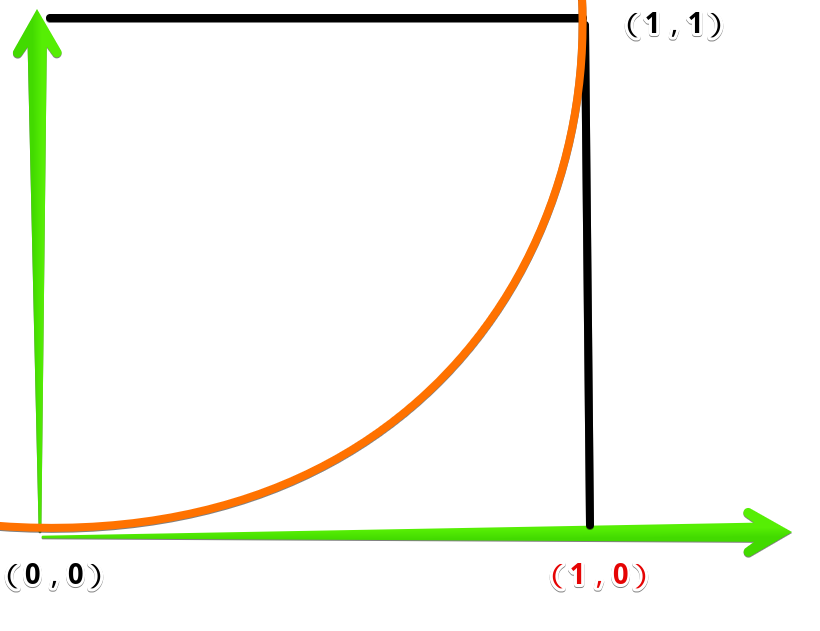
| animation-timing-function | 定义CSS动画在每一动画周期中执行的节奏 | ease / ease-in / ease-out / ease-in-out / linear / steps(4, end) / cubic-bezier(0.1, 0.7, 1.0, 0.1) / step-start / step-end |
| animation-fill-mode | 动画在执行之前和之后如何将样式应用于其目标。 | none / forwards / backwards / both |
animation-direction
<body>
    <div id="container">
        <div id="ball"></div>
    </div>

    <style>
        #container {
            position: relative;
            width: 200px;
            height: 500px;
            background-color: rgb(118, 144, 233);
            overflow: hidden;
        }
        #ball {
            width: 100px;
            height: 100px;
            margin-left: 50%;
            transform: translate(-50%, 0);
            background-color: #fff;
            border-radius: 50px;

            animation-name: jump;
            animation-delay: 1s;
            animation-duration: 3s;
            animation-direction: alternate;
            animation-iteration-count: infinite;
        }
        @keyframes jump {
            0% {
                margin-top: 0%;
            }
            100% {
                margin-top: 400px;
            }
        }
    </style>
</body>
1
2
3
4
5
6
7
8
9
10
11
12
13
14
15
16
17
18
19
20
21
22
23
24
25
26
27
28
29
30
31
32
33
34
35
36
37
2
3
4
5
6
7
8
9
10
11
12
13
14
15
16
17
18
19
20
21
22
23
24
25
26
27
28
29
30
31
32
33
34
35
36
37
- 动画
 * 效果:
* 效果: