# 基本概念
flex
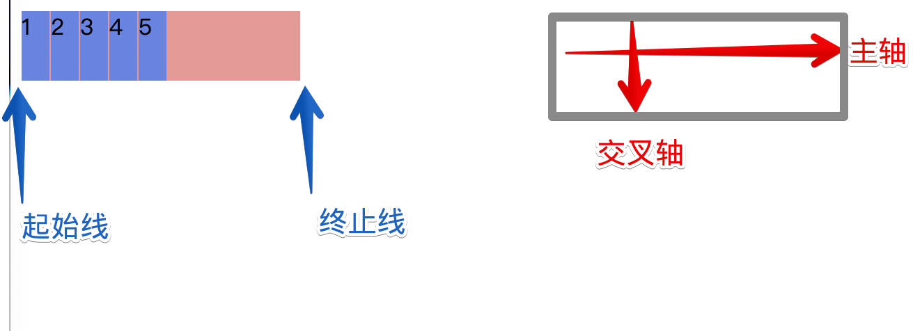
- 两根轴:主轴和交叉轴
- 主轴:flex-direction
- 交叉轴:垂直于主轴
- 两根线:起始线和终止线
- flexbox 的特性是沿着主轴或者交叉轴对齐之中的元素。
- 可用空间:父元素【主轴方向的长度】减去【所有子元素相加】
- 默认情况下可用空间有剩余会放在最后一个元素之后
- 可以修改flex子元素属性来修改可用空间的使用
# flex容器
display
| 值 | 效果 |
|---|---|
| flex | 设置默认flex盒子 |
# flex-direction
flex-direction
| 值 | 效果 |
|---|---|
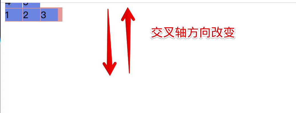
| row | 【默认】横向主轴 |
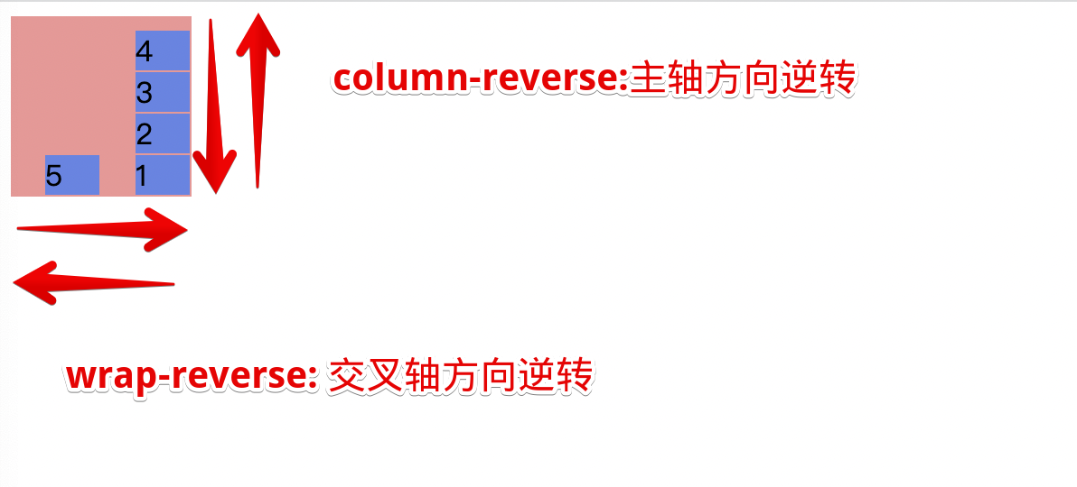
| row-reverse | 主轴横向,所有元素倒序排 |
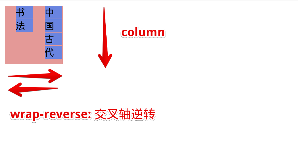
| column | 主轴纵向 |
| column-reverse | 主轴纵向且倒序排 |
reverse的情况下起始线和终止线互换了
flex-direction
<body>
    <div id="container">
        <div class="child">1</div>
        <div class="child">2</div>
        <div class="child">3</div>
        <div class="child">4</div>
        <div class="child">5</div>
    </div>

    <style>
        #container {
            display: flex;
            background-color: rgb(241, 149, 149);
            width: 200px;
            height: 25px;
            flex-direction: row-reverse;
        }
        .child {
            background-color: rgb(98, 133, 231);
            width: 20px;
            margin-right: 1px;
        }
    </style>
</body>
1
2
3
4
5
6
7
8
9
10
11
12
13
14
15
16
17
18
19
20
21
22
23
24
2
3
4
5
6
7
8
9
10
11
12
13
14
15
16
17
18
19
20
21
22
23
24
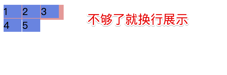
# flex-wrap
flex-wrap
| 值 | 效果 |
|---|---|
| nowrap | 【默认】元素被摆放到到一行,这可能导致溢出 flex 容器 |
| wrap | 元素超出父盒子大小会被换行处理 |
| wrap-reverse | 换行,交叉轴方向逆转 |

# flex-flow
flex-flow
- flex-direction 和 flex-wrap 的组合简写
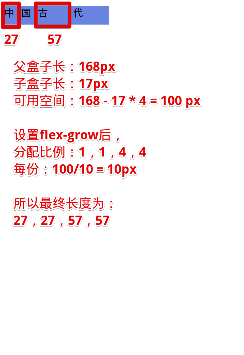
# flex-grow
flex-grow
- 作用:决定父盒子分配剩余空间的比例,不允许负数
| 值 | 效果 |
|---|---|
| 【>0正数】 | 剩余可用空间的分配增长系数 |
| 默认1 | 所有元素等比分配 |
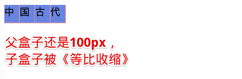
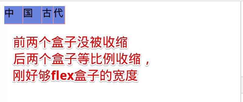
# flex-shrink
flex-shink
- 作用:指定flex盒子可用空间不足时,子元素的收缩规则,该数值越大,收缩的程度越大
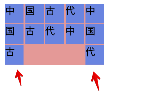
# flex-basis
flex-basis
- flex 子元素在主轴方向上的初始大小
| 值 | 效果 |
|---|---|
| 【width值】 | 【默认,就是跟着width值】可以用auto 或者具体的像素大小 |
| content | 早期没有,可以用auto |
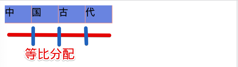
默认就是按照内容所占的大小分配
flex-basis
<body>
    <div id="container">
        <div class="child">中</div>
        <div class="child">国</div>
        <div class="child">古</div>
        <div class="child">代</div>
    </div>

    <style>
        #container {
            display: flex;
            background-color: rgb(241, 149, 149);
            width: 180px;
            height: 30px;
        }
        .child {
            background-color: rgb(98, 133, 231);
            margin-right: 1px;
            margin-bottom: 1px;
            flex-basis: auto;
        }
    </style>
</body>
1
2
3
4
5
6
7
8
9
10
11
12
13
14
15
16
17
18
19
20
21
22
23
2
3
4
5
6
7
8
9
10
11
12
13
14
15
16
17
18
19
20
21
22
23
# flex
flex
- 混合属性,按序
- flex: xx yy zz;
- flex-grow
- flex-shrink
- flex-basis
| 值 | 相当于 | 效果 |
|---|---|---|
| initial | 0 1 auto | 不分配可用空间,等比例压缩,按照width宽度排大小 |
| auto | 1 1 auto | 等比例分配可用空间,等比例压缩,按照width宽度排大小 |
| none | 0 0 auto | 不分配,不压缩,原样展示,多的溢出 |
| 1 | 1 1 0 | 等比例分配可用空间,等比例压缩,不管原始大小 |
flex
<body>
    <div id="container">
        <div class="child child1">中</div>
        <div class="child child1">国</div>
        <div class="child child2">古</div>
        <div class="child child2">代</div>
    </div>

    <style>
        #container {
            display: flex;
            background-color: rgb(241, 149, 149);
            width: 180px;
            height: 30px;
        }
        .child {
            background-color: rgb(98, 133, 231);
            margin-right: 1px;
            margin-bottom: 1px;
            width: 30px;
            flex: initial;
        }
    </style>
</body>
1
2
3
4
5
6
7
8
9
10
11
12
13
14
15
16
17
18
19
20
21
22
23
24
2
3
4
5
6
7
8
9
10
11
12
13
14
15
16
17
18
19
20
21
22
23
24
# align-items
align-items
- 子元素交叉轴方向的对齐方式
| 值 | stretch |
|---|---|
| stretch | 【默认】弹性子盒子被拉伸到flex盒子相同的交叉轴长度 |
| flex-start | 交叉轴起点对齐 |
| flex-end | 交叉轴终点对齐 |
| center | 居中 |
align-items
<body>
    <div id="container">
        <span class="child child1">中</span>
        <span class="child child1">国</span>
        <span class="child child2">古</span>
        <span class="child child2">代</span>
    </div>

    <style>
        #container {
            display: flex;
            background-color: rgb(241, 149, 149);
            width: 150px;
            height: 30px;
            align-items: stretch;
        }
        .child {
            background-color: rgb(98, 133, 231);
            margin-right: 1px;
            margin-bottom: 1px;
        }
    </style>
</body>
1
2
3
4
5
6
7
8
9
10
11
12
13
14
15
16
17
18
19
20
21
22
23
2
3
4
5
6
7
8
9
10
11
12
13
14
15
16
17
18
19
20
21
22
23
# align-self
- flex盒子的子元素使用,覆盖父盒子的align-items的布局属性
<body>
  <div class="father">
    <div class="child1"></div>
    <div class="child2"></div>
    <div class="child3"></div>
  </div>

  <style>
    .father {
      display: flex;
      flex-direction: column;
      align-items: center;
      width: 150px;
      background-color: rgb(241, 216, 216);
    }
    .child1 {
      align-self: start;
      height: 30px;
      width: 30px;
      background-color: #333;
    }
    .child2 {
      align-self: center;
      height: 30px;
      width: 30px;
      background-color: #333;
    }
    .child3 {
      align-self: end;
      height: 30px;
      width: 30px;
      background-color: #333;
    }
  </style>
</body>
1
2
3
4
5
6
7
8
9
10
11
12
13
14
15
16
17
18
19
20
21
22
23
24
25
26
27
28
29
30
31
32
33
34
35
2
3
4
5
6
7
8
9
10
11
12
13
14
15
16
17
18
19
20
21
22
23
24
25
26
27
28
29
30
31
32
33
34
35
# justify-content
justify-content
- 作用:分配主轴元素位置与剩余可用空间的关系
| 值 | 效果 |
|---|---|
| start | 每行与第一个元素对齐 |
| end | 向主轴尾部对齐,可用空间放起始线方向 |
| center | 居中,可用空间等比放两边 |
| space-between | 均匀分配中间元素和可用空间,两侧元素靠边 |
| space-arround | 均匀分配所有元素和可用空间,【1元素1 1元素1】的形式 |
| space-evenly | 均匀分配所有元素和可用空间,【1元素1元素1】 的形式 |
justify-content
<body>
    <div id="container">
        <span class="child child1">中</span>
        <span class="child child2">国</span>
        <span class="child child3">古</span>
        <span class="child child4">代</span>
        <span class="child child1">中</span>
        <span class="child child2">国</span>
        <span class="child child3">古</span>
        <span class="child child4">代</span>
        <span class="child child1">中</span>
        <span class="child child2">国</span>
        <span class="child child3">古</span>
        <span class="child child4">代</span>
    </div>

    <style>
        #container {
            display: flex;
            background-color: rgb(241, 149, 149);
            width: 160px;
            height: 100px;
            flex-wrap: wrap;
            justify-content: start;
        }
        .child {
            background-color: rgb(98, 133, 231);
            margin-right: 1px;
            margin-bottom: 1px;
        }
        .child1 {
            width: 20px;
            height: 25px;
        }
        .child2 {
            width: 20px;
            height: 20px;
        }
        .child3 {
            width: 20px;
            height: 25px;
        }
        .child4 {
            width: 20px;
            height: 15px;
        }
    </style>
</body>
1
2
3
4
5
6
7
8
9
10
11
12
13
14
15
16
17
18
19
20
21
22
23
24
25
26
27
28
29
30
31
32
33
34
35
36
37
38
39
40
41
42
43
44
45
46
47
48
2
3
4
5
6
7
8
9
10
11
12
13
14
15
16
17
18
19
20
21
22
23
24
25
26
27
28
29
30
31
32
33
34
35
36
37
38
39
40
41
42
43
44
45
46
47
48